
AIRFIELD
BC3’s Denver office completes its first design in The Centennial State. The project is a design-build collaboration with two local General Contractors: JKS Industries and Gilmore Construction. The scope was to convert an existing exterior space into an outdoor amenity for the local workforce.
IDEAS
Each scheme had the same goal but expressed in ways that increased the number and complexity of the forms on the site. The team wanted to create a lunchtime destination for the users to relax and enjoy the outdoors. The key attributes were security, visually interest, durability and low maintenance. Each scheme was meant to fall into a cost category of “Good”, “Better”, “Best”. All of the schemes provided seating and an area for BBQ grilling. The latter two schemes incorporated shading elements that would allow for large annual gatherings.
SCHEME 01 - GOOD
Scheme 01 was the simplest and least costly scheme where we proposed saw cutting the existing concrete slab with rectilinear shapes of varying size while concentrating the largest forms nearest the areas where the grilling would occur. We defined these areas as the most social. Farthest from the grilling areas the forms would be smaller and farther apart. The square shapes would be filled with either pervious paving or low maintenance planting materials. The bench seating would be along the edges of the forms to help define their shape and establish their boundaries within the large open space.
SCHEME 02 - BETTER
In this scheme we sought to create a large open green space (with low maintenance plantings) with an irregular border. The irregularities would create smaller “nooks” or areas that were hierarchically smaller–offering more privacy for smaller groups of people. This scheme also focused on axial relationships outside of the project site. This axis was reinforced with the entrance into the plaza and was the reason why we located the simple rectangular canopy where we did. This was the area that was both for BBQ grilling and where we envisioned the large annual gathering to occur. We used the bench seating to define the borders of the green space but also cap them with wood for comfort and to strengthen the relationship to the organic material onsite.
SCHEME 03 - BEST
Internally we described this scheme with a few different analogies–Moonshot and “swing for the fences”, to reflect that this scheme was intended show the client the true potential of the project if they elected to invest more financial resources. In this scheme we really focused on the space being an oasis–a respite for the daily grind of work and a visually engaging destination that could support varying degrees of interaction. We created space for communal eating, quiet repose, large event space and casual seating. We sought to layer and reinforce relationships outside of the site while building an inward focus.
Building Center No.3: Architecture firm in Miami; interior designer in Miami; landscape design in Miami.

THE PLANTERS
The planters in Scheme 03 were pushed the periphery (as opposed to the interior of the space in the other schemes) to allow more seating and diverse programming. It also allowed us to cradle the users within a green buffer. Much of what is beyond the site is harsh, lifeless industrial use. By creating this green buffer we tried to create a “parallel universe” where taking a lunch break transports you to a green space where you can control and mediate your desired level of interaction with others. The walls of the planters slope outwards to provide a “rooted” sensation and seating is carved out of the walls and planters so that at that moment you are surrounded on three sides by greenery. The walls of the planters also change heights as they move along the perimeter of the space–at the entrance they start at their lowest point flush with the ground to make the entrance less imposing and more visible (as opposed to starting at 3 feet or taller which would have created a more imposing gateway sensation). As the planter walls move away from the entrance they undulate until the two sides converge at the central axis of the entrance–here the planter walls dip to form a “V” to expose the back wall of the planter where we would have the insignia of the user group.
THE CANOPY
The canopy form was meant to evoke the wing of an airplane–a metaphor that relates to the occupation of the user group. There are 3 “wings”: a primary wing (taller, larger and thicker) a secondary wing and a tertiary “green” wing which is created by a trellis whose vines and greenery are grown from a planter at the base of the support columns. These wings were placed on the south edge of the plaza to provide maximum shade for the users. We had previously aligned it on the east directly in front of the entrance but realized we wanted more sun protection. The materiality of the wings would be aluminum cladding much like an airplane and the columns are “V” shaped to reduce the numbers of footings and drive down the costs slightly, while providing a visually interesting form.
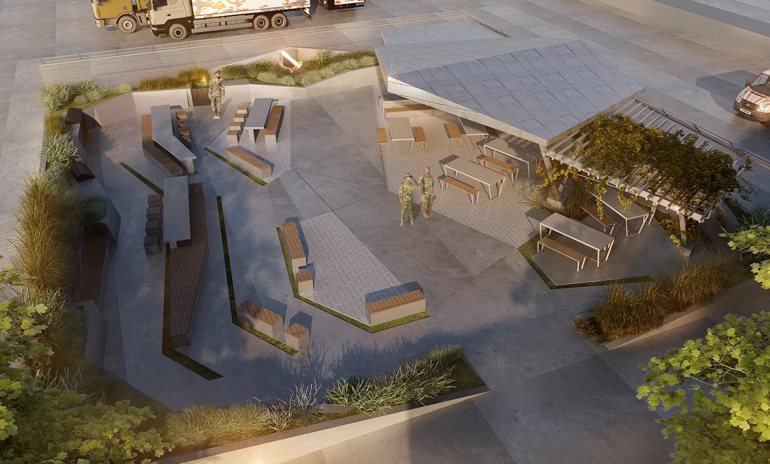
SEATING AND GREEN SPACE
Most of the seating is built-in–particularly on the opposite side of the wing canopies. We capped the seating with wood for the same reasons in the previous schemes–to soften the space and build a connection with the organic elements on the site. Beneath the canopy the seating and picnic tables are outdoor furniture and can be moved to accommodate different types of program and events throughout the year. The hardscape is the existing concrete slab but we are proposing saw cutting the slab and planting greenery in the slots or installing decorative stones. Those slots occur opposite the canopy because we were establishing a relationship with the greenery (existing lawn) on the left side of the site just outside the plaza. The lawn itself is not very interesting but in our plaza we making a subtle reference to it.
The paving inserts are meant to be pervious areas that allow the space to drain to the subsoil and eliminate the need for costly subsoil drainage work. Most of the pervious paving is under the canopy which also established the area as visually more important since that is where we planned for major annual events to take place–speakers to speak from, etc. The smaller areas that are paved opposite the canopy but closest to it are also intended to foster a relationship with the larger paved area–together the paved areas represent the “public” zones within the space and the seating is oriented toward the largest canopy.
CLOSING
Our hand sketches really drove the process and development of the project–as opposed to the 3D modeling and 3D printing which we only produced at the end for scheme 3 to provide high quality renderings. There are many tools available to us as designers and it is up to us to determine which ones will serve the project best. Within five days all of the schemes were fully developed and had the influence of four different design team members. We think this project is great example of where two of our three design disciplines (Architecture and Landscape Design) converged and produced three vastly different solutions within a short period of time.